Yelp Spotlight

iOS Summer ‘18 2 weeks

The best of a travel guide — on Yelp.

Overview

We designed a new place in Yelp’s mobile app for curated articles that highlight food trends, vacation itineraries, neighborhoods, and other highly local insights.

Our goal was to bring what people love about travel guides to Yelp. Each ‘Spotlight’ article provides a high-level overview of a topic and recommends several thematically related businesses. Spotlight enables people to explore an entire city through rich narrative, rather than single businesses in isolation.

A photo of a desk, viewed from above. In the center of the shot, Yelp Spotlight is open on two iPhones. Next to the phones are a map and a camera.

My Role

  • Interaction design
  • Visual design
  • Usability testing
  • Ideation
  • Interviews & research
  • Storyboarding

Output

  • HiFi prototype
  • Design system
  • Wireframes
  • User scenario
  • Proto-persona

Tools

  • Sketch
  • Principle
Focus Area 1

Design System

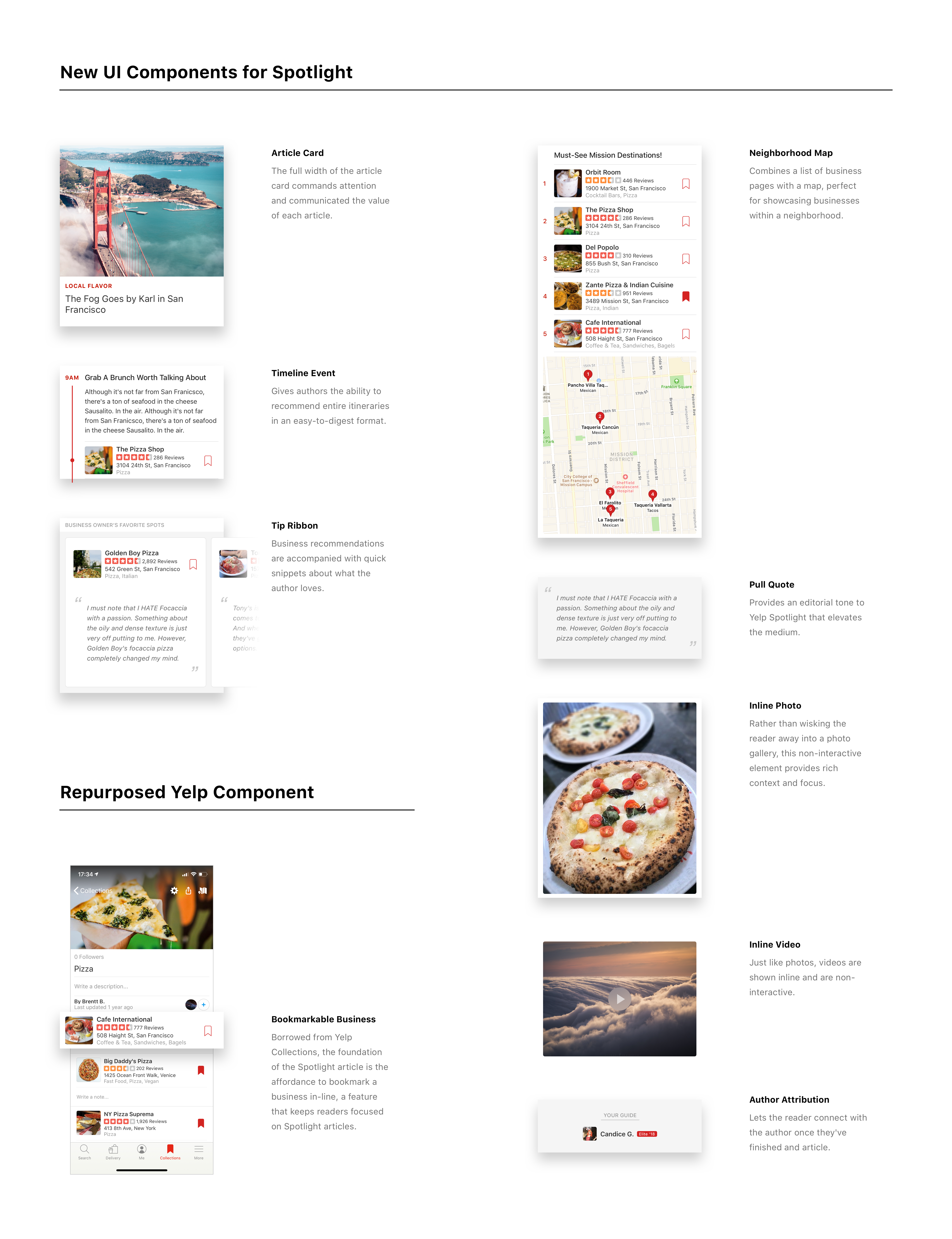
Spotlight articles utilize one of seven templates. We designed each template to be modular, leveraging a combination of existing Yelp UI and new components that support the article format. The result harmonizes Spotlight with the rest of the app and provides stylistic freedom to authors with flexible templates.

Challenges

  • How can we leverage existing Yelp UI components?
  • How can we honor the theme of each template?
  • What media should a Spotlight article contain?

Takeaways

  • Reuse existing UI to provide a cohesive experience, not just to speed up design
  • Address feature-creep immediately
  • Look to physical sources for inspiration, such as travel guides
7 iPhones are shown running Yelp Spotlight, each depicting one of the following templates: Review of the day, Meet the Owner, Neighborhood, Itinerary, Cuisine Focus, Seasonal, and Local Flavor.
A graphic depicting the new UI Components created for Yelp Spotlight, and the existing Yelp Component 'Bookmarkable Businesses', which was leveraged in many parts of Yelp Spotlight's UI
Focus Area 2

Interaction Design

In order to keep the written narrative the focus of each Spotlight article, I explored interaction patterns that would complement rather than compete with the author’s voice.

Challenges

  • How can we show a list of businesses within an article without overwhelming the reader?
  • How do we convey the value of each curated article?
  • How can we minimize distractions?

Takeaways

  • Utilize ribbons to surface secondary content with minimal real estate
  • Provide contextually relevant actions to reduce distractions
  • Communicate the value of content through judicious restraint of user freedom