Triangle

iOS App 2013 - Present

More flexible control of smart lighting.

Overview

I designed and shipped an iOS app for controlling a home’s smart lighting. The interface consists of triangles which both display the current lighting and are used to adjust its color and brightness. The nested triangles make it easy to group and control any combination of lights on the fly.

Triangle app is shown running on an iPhone, which is used to control smart home lighting. In the background are 4 household lights, each a different color, corresponding to the app's 4 colored controls on-screen.

My Role

  • Interaction design
  • Motion design
  • Visual design
  • Interviews & research
  • Ideation
  • Usability testing
  • Developer handoff

Output

  • Wireframes
  • LoFi & HiFi prototypes
  • Tutorial video
  • iOS app (App Store)
  • US patent (pending)

Tools

  • Pixate
  • Principle
  • Sketch
  • Hype
Focus Area 1

Interaction Design

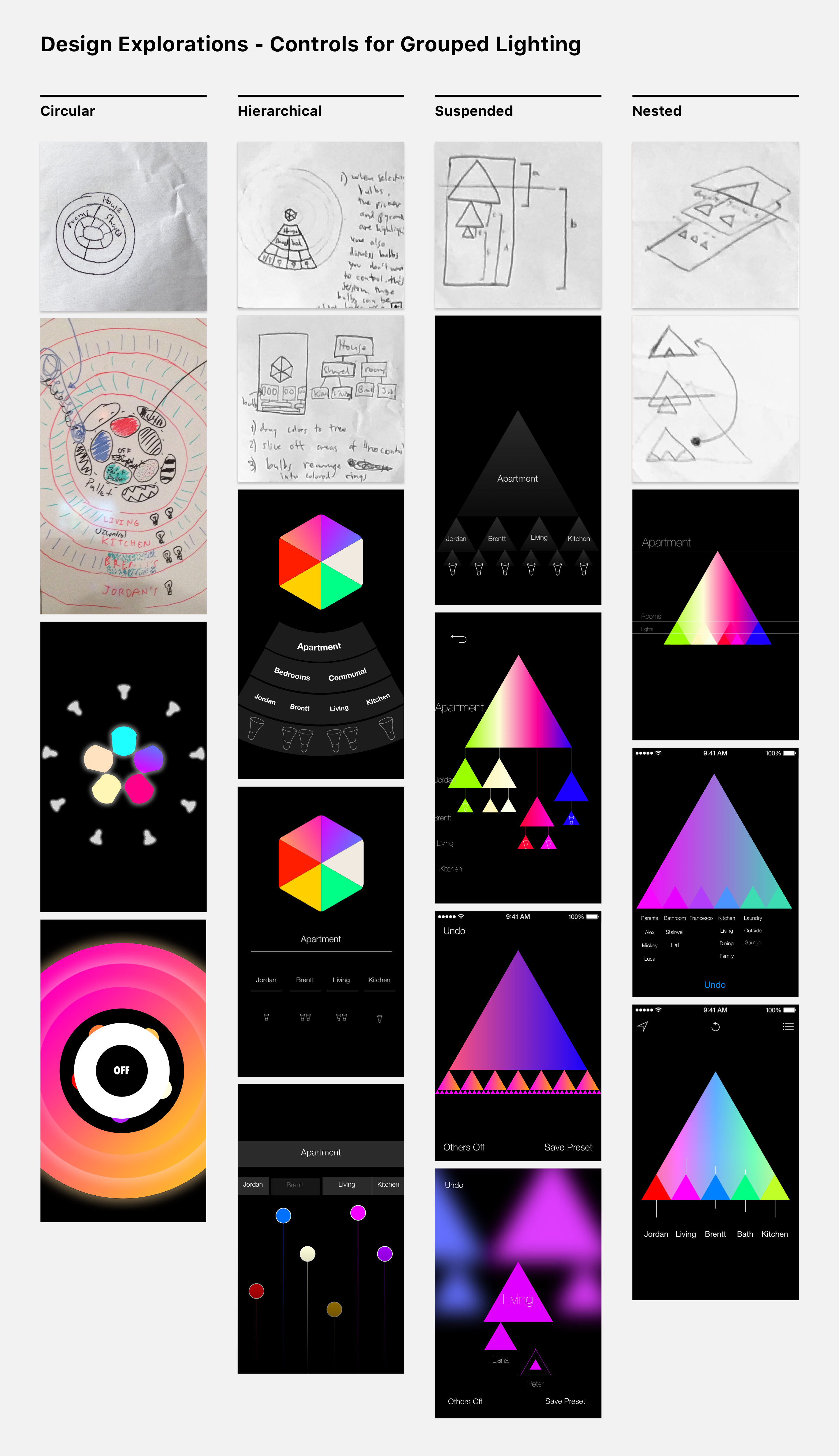
My interviews surfaced that people are often frustrated with the inflexibility of static lighting groups (e.g. living room). I designed Triangle to allow people to easily group and ungroup lights so they can control just what they need — tapping the name of a triangle hides it, and tapping below brings it back.

Challenges

  • Can controlling many lights be as simple as just one?
  • How can we let people control “all the other lights”?
  • How can we make it quick to find the right control?

Takeaways

  • Start usability testing ASAP
  • Design for the “first-run experience”
  • Prioritize — polish the most used interactions first
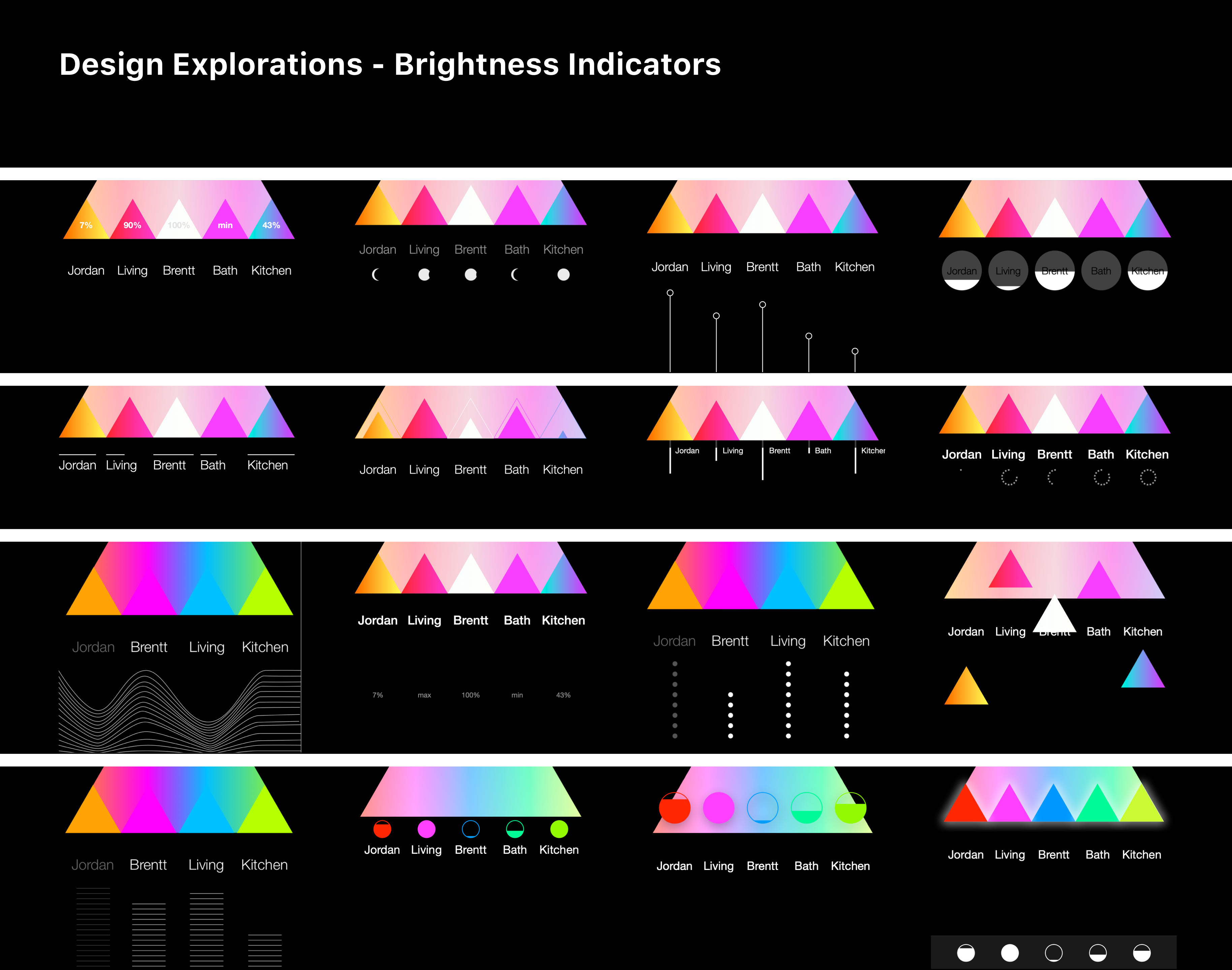
A graphic depicting UI explorations for brightness lines in Triangle app.
A graphic depicting UI explorations for grouped lighting in Triangle app.
Focus Area 2

UI Design

Triangle’s UI plays two roles. As a tool, it affords control of a home's lighting. As an information graphic, it communicates data (lighting) in visual form. I was inspired by Edward Tufte to approach Triangle's UI as a study in information graphics, while also providing powerful control of grouped lighting.

Challenges

  • How can we elegantly display the current lighting?
  • Should brightness be shown with color or symbol?
  • How do we display lights, rooms, and the home?

Takeaways

  • Make paper prototypes & guerrilla test!
  • Use standard UI patterns in most cases
  • Signifying affordances in new UI is challenging