CampBuddy

Desktop Web Summer ’19 8 weeks

Enjoy hassle-free camping!

Overview

We reimagined how the casual camper might plan their trip if they didn’t have to worry about gear ownership, transportation, or assembly.

Our design is a playful web-based experience that guides the prospective camper through every step of the gear selection process. By making camping gear logistics easier, the casual camper won’t be intimidated by planning their next trip.

A screenshot of CampBuddy on desktop web shows the illustrated, interactive campground where people are shown camping gear they're about to order, in context.

My Role

  • Interaction design
  • Motion design
  • Visual design
  • Ideation
  • Usability testing
  • Interviews & research

Output

  • User flow diagrams
  • Wireframes
  • LoFi prototypes
  • HiFi prototypes
  • Illustrations

Tools

  • Sketch
  • Principle
  • Miro
Focus Area 1

Wireframing & Iteration

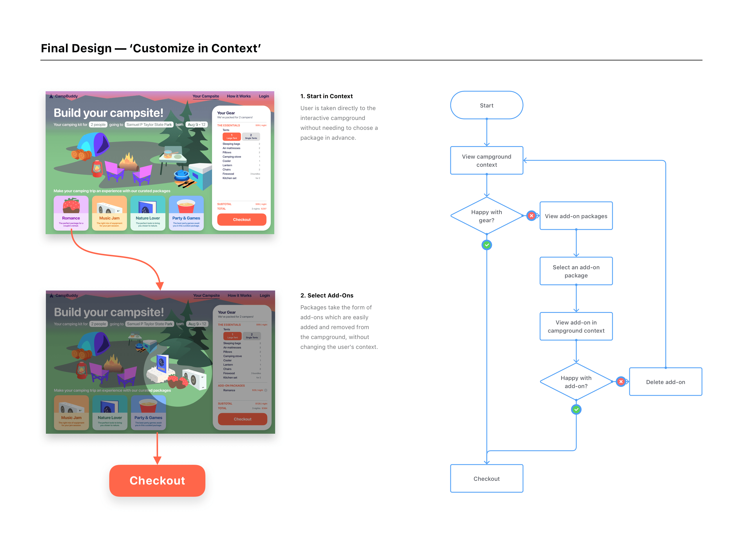
We initially suspected that offering preconfigured packages would simplify the customer experience for the casual camper. In the end, we learned that forcing users to choose a package up front made them feel limited and disempowered. We landed on a solution that lets users easily swap between packages within the idealized context of a cartoon campground.

Challenges

  • How can we make gear selection feel approachable?
  • How can we communicate what the service offers?
  • How can we explain that the service is limited to certain areas?

Takeaways

  • Poor user flows can make people feel disempowered
  • Mental models differ between user and designer
  • Set service expectations early and clearly to avoid frustration
A diagram depicts early wireframes and the resulting user flow. When traversing that flow, users first are shown 3 packages. They need to choose one before they are taken to the interactive campground. Below this flow, a photo of usability testing is shown in which the participant said 'I don't really want a package, I wanna see a menu of everything I can rent'. This testing let us know we needed to explore options that didn't make the user feel restricted.
A diagram depicts the final wireframe that resulted in the current user flow. This flow, unlike the early design depicted before, takes the user directly to the interactive campground instead of presenting them with 3 package options; only once the user is at the interactive campground are they given the choices to apply add-one packages, which can be easily swapped out while keeping the user in the same context (the interactive campground).
Focus Area 2

UI & Prototyping

Rather than adopting a typical shopping cart metaphor, I designed a UI that visualizes an ideal campground and shows the gear each package contains. I leveraged illustration and overshot spring animations throughout, making even tedious tasks like data entry fun and lighthearted.

Challenges

  • How can we make gear selection delightful?
  • How can we make mundane data entry engaging?
  • What are alternatives to modal disclosure that people won’t ignore?

Takeaways

  • Design motion that complements brand identity
  • Leverage animation in place of modal dialogues
  • Use illustration to engage people's imagination